This is my final promotional package for my album. This blogpost is written by me (Kalista)
Music Video
MV YouTube link: https://www.youtube.com/watch?v=f7VFhzgcyUM
This is my final promotional package for my album. This blogpost is written by me (Kalista)
Music Video
MV YouTube link: https://www.youtube.com/watch?v=f7VFhzgcyUM
How do your products represent social groups or issues?
How do the elements of your production work together to create a sense of ‘branding’?
How do your products engage with the audience?
How did your research inform your products and the way they use or challenge conventions?
In line with the Cambridge brief for Component 3, students are required to create a music promotion package for an album, consisting of a music video (MV), an official social media page for the artist, and a digipak. My group and I developed a fictional Indonesian pop artist named "Cinta Kyle"—a bold, confident, and slightly flirty 19-21-year-old Southeast Asian female artist. Her persona plays with deception, initially appearing innocent and feminine, though the music video reveals a more cunning side. Moreover, the music video reads the only form of teenage love as a negative, one sided relationship and explores complex romantic dynamics, resonating with a specific audience of teenagers and young adults aged 16-25.
Throughout the extensive research that we did according to pop genre conventions we conform the stereotypes of a Pop MV that represent social groups through casting only south east Asian casts. We take most of our inspirations from a well-known singer “Sabrina Carpenter” where she uses a kiss trademark as her essence and her target audience also matches with ours with Carpenter’s target audience is primarily young women aged 18-24, with over 75% of her listeners being female.
Based on our music video (MV) our product has represented social groups mainly through the clothings that the main and side character is using. (Fig. 1) The Star is using a maroon red top and black skirt that symbolises that she is bold, confident, and holds power. On the other hand the side guy is wearing a white colored t-shirt that represents purity and innocence. Throughout the MV all of the side guys are wearing white t-shirts which contradicts the Star that uses such a striking color. This also shows that the Star is the one with control or power over the relationships. In contrast, in the early part of the MV (Fig. 2) the Star could be seen wearing a light pink colored top which generally symbolizes softness, gentleness, and femininity. This shows how her character has transformed from a gentle and feminine woman to a woman that possesses captivating charm knowing exactly how to turn heads and take control. Additionally, the mise-en-scene of the high camera angles the clip when Cinta is laying in her bedroom using a pink pyjama shows that she is head over heels for the main guy where it can be seen that Cinta is acting giddy which conveys that she is deeply infatuated, emphasizing her vulnerability and emotional investment in the relationship.
Branding is one of the most important factors when creating a product, as it creates a memorable impression between the Star, product, and ideologies. We incorporated a variety of elements to create a sense of branding. One was to associate our star Cinta with the colour maroon and lipstick. We consistently included these symbols in our CD digipak (Fig. 3), music video (Fig. 4), as well as social media (Fig. 5). As a deeper shade of red, the maroon colour connotes a more mature feeling, while the pink is innocent and submissive. The two are used across our products to show the two sides to her personality. Another symbol we used in our branding is the lipstick. It conveys Cinta’s transition into womanhood and features heavily in the design of our digipak and music video. Finally, we also used consistent typefaces throughout our products. The serif typefaces convey a sense of elegance, sophistication, and personal touch which is aligned with the persona of Cinta that we wanted to showcase. We believe that repeated use of these typefaces will be instantly recognisable by our target audience. Additionally, the high-heeled boots (Fig. 6) is also apart of Cinta’s style as it can convey professionalism and a certain level of self-assurance this is after her heart is broken due to the toxic relationship that she encountered this relates to Dominant reading (Stuart Hall) with love being unreliable showing transformations of one’s character and how Cinta is able to take control over her own life after being in a one sided relationship.
Our products challenges conventions as we tried to create our MV as creative through combining both performance and storyline in the music video. Through creating a twist in the persona of Cinta which is feminine at first and how her persona switched to a bold character this is also align with binary opposites theory (Levi Strauss), femininity vs female empowerment as well as we tried to subvert the conventions of a usual pop genre as women in pop music video are often seems as passive which lead to our approach which is to make Cinta initiates and dominates interactions as she toys with her love interest, reversing the power dynamics as usually men are being referred to as the ‘player’ now we are making our female Star to hold that power which subverts traditional gender role this relates to Feminine discourse theory (Van Zoonen) as it challenges traditional norms and offers audiences an empowering and assertive female figure. Additionally, the minimalist and simple design of the back cover of the digipak is also unique as most pop digipaks tend to feature bright bold visuals and images of the artists to capture attention of audiences, in contrast, we use a deep maroon textured background with elegant serif typography. This gives the product a timeless, mature, and sophisticated tone, which subverts the youthful, bubbly aesthetic often linked to pop.
Through our digipak we conform to the generic conventions such as using medium shots of the artist as our main cover. This connotes the Star is the main attention and how we really focus on the artist in our overall product. The direct mode of address of the artist looking directly to the camera also speaks directly to the audiences which creates connections which conform the generic convention of pop digipak cover. We incorporated a cursive font with dark red color which we use repetitively throughout all of our product to create brand identity that our audiences could be familiar with (Fig. 7). Moreover, what subvert our digipak from any other digipak that we have researched would be the inside left of our digipak that is a shot of our Star’s reflection from a mirror which implies the mirror shot suggests a "hidden side" (Fig. 8) to Cinta Kyle, tying into her MV persona (outwardly innocent, secretly bold).
Additionally, our product engages with the audiences mainly through social media platforms such as Youtube, Instagram, as well as link trees (Fig. 9) Through social media we balance out to portray the artist in a professional yet personal manner. Star’s Instagram post contains informal pictures such as BTS of shooting the MV, childhood nostalgia videos, travel photo dumps while also being professional by promoting her album, billboard picture, as well as magazine featured artist. Not only that, Cinta also uses the Instagram story features such as question box where audiences could fill by asking anything and she replied some of them through videos (Fig. 10) this supports Social Relationship theory (Blumler & Katz) as it creates a sense of personal connections between Cinta and her fans even though followers are not interacting with her in real life, these digital interactions allow them to feel involved in her life and career this correlates with End of Audience theory (Clay Shirky) that the traditional passive audience has changed to a much more interactive experience especially due to technological advancement and new media taking over it has significantly increases the convenience of interactive social media.
Overall, the purpose of our product would be to create a brand identity across platforms and be able to create a consistent brand image that would be recognizable and align with our target demographics. I believe we have done our best in collaborating and integrating our media skills for our component 3 project.
FIGS LINK Incase being needed
Below you can find how I used combinations of technical elements in my Music Video (MV) to create meaning. This blogpost is written by me (Kalista).
This is my blogpost for my behind the scenes music video project. This blogpost contains canva BTS slides that is being made by my teammate (Chelsea).
This is my blogpost for my research on music video regulation for my comp 3 project where me and Chelsea did the work together. This blogpost is written by me (Kalista).
There are some rules that we need to follow before creating our music video, which may be interpreted as censorship or regulation. We had been suggested by Cambridge to avoid talking sensitive issues like the use of weapons, dangerous stunts, suicide and drug usage. Vehicle safety concerns were also discouraged. Since we also attend a conservative school, the teacher and the school must provide appropriate content, things like inappropriate language, no explicit music, and violence are refrained.
As it is not easy to find the Indonesian rating system, me and my teammates decided to use the British rating system, namely BBFC, which is being broken down into 7 categories from the media content that is suitable for all until the one that is suitable only for adults. Based on the rating system, our music video plan (unrequited & complexity of love during youth) and song choice (“The Weekend” by BIBI) is categorised to be suitable for 15 years and over due to several reasons:
Use of substance: We have included an implication of alcohol usage (red cup) whilst in fact it is containing water. It is appropriate for our star to act "tipsy" when utilising this prop because she is 18 years old in real life, which is similar to her artist's age. However, since the scene will only last a few seconds, hence the audience is not particularly encouraged or promoted by it.
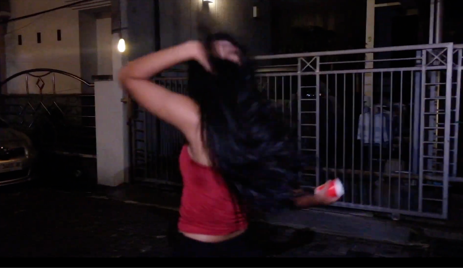
Language: Only one bad word—the "S" word—is used in the song's lyrics, but in order to avoid encouraging strong language, we won't have the artist say the word in our music video. Instead, we will show a different scene without lip-syncing.
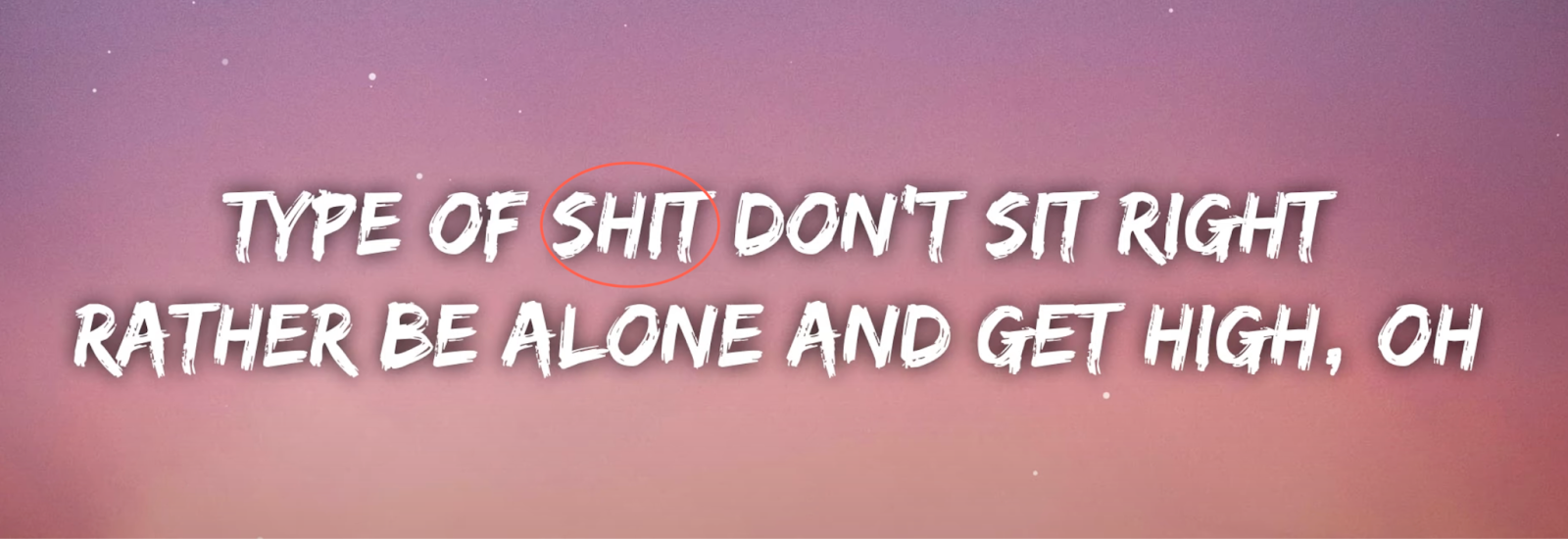
Theme: As previously stated, the theme of our song and music video centers on complicated romantic relationships and unrequited love, which tend to be more relatable to teenagers who are much older. For this reason, we believe that it is appropriate for those who are at least 15 years old, as those who are younger may not fully comprehend the context, which could lead to misinterpretation and encourage them to engage in negative behavior.
SONG PERMISSION
Since we want to use BIBI & 88rising’s song "The Weekend" for our music video, we must ask the record label for permission to use it. Chelsea found the email address to contact 88rising, the record label that BIBI is under, here: https://88rising.com/terms-of-service. This includes the licensing agreement that grants permission to utilise the song. The email address was info@88rising.com. The email request that we sent, which Kalista (me) wrote and delivered, is below:
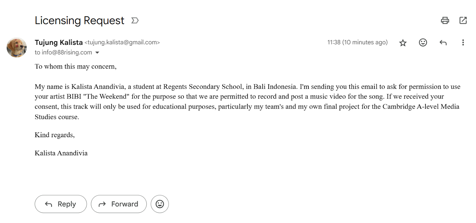
Since this is simply just a school project and we are not seeking financial gain, we are not expecting any replies to the email and in fact we end up not receiving any. As long as it's being utilised for the proper purposes, we have chosen to just stick with it. By sending the email request to 88rising (BIBI's record label), we have taken this action to avoid any copyright restrictions and further problems, like the ones on YouTube.
Self-reflection: Before creating our music video, it is essential to follow the rules that are being set by our school, Cambridge, as well as BBFC. We consider these rules to avoid including content that might cause any unwanted issues or harm to third parties. Moreover, we also want to prevent re shootings if any of our scenes is against the procedures being published online. Since we would be posting our Music Video (MV) in Youtube we made sure that we did not break our school rules and did not include harmful, negative, or sensitive content in our MV. Additionally, we also established age rating category in which our product falls under and we decided that our MV rating is suitable only for 15 years and over since we did include a brief alcohol being implied by 'red cups' however it was actually filled with water. We also did not include any violence, dangerous behavior, discrimination, etc that is not aligned with the BBFC.
We also agreed that it is still needed and important to ask for song permission from the record label to notify them and for us to receive permission and proper license since using copyrighted song without their permission would be against the stated law. Hence, we decided to ask permission to use the song professionally. However, even though we did not receive any email response until the end this awareness will help me to take responsibility of my action.
This is my editing blogpost for my music video project. This blogpost is created by my teammate (Chelsea).
This is my audience feedback for my music video project. This blogpost is written by all of us together (Kalista, Chelsea, Rara, and Audrey).
The purpose of a screen test is to gain audience feedback about our work and see if there are any improvements that can be made. We decided to use Google Forms to create a survey to share with our audience because of the platform’s availability to collaborate online and allow sharing to others which made it easy for production and distribution. This online platform utilization is also quick so audiences are more encouraged to engage with our survey.
We divided our questions into sections in relation to different components of our product.
Here are our questions:
Section ‘Music Video’:
(Several short snippets from our music video are shown)
Do you relate to some of the elements in our product?
What message do you think we are trying to convey from our concept?
What is the most memorable scene from our music video to you?
Section ‘Digipak’:
(Images of our digipak cover and inspiration pictures are shown)
Which digipak are you attracted to the most? (1/2/3)
What is the most appealing feature from our digipak?
How likely would you purchase our digipak from its cover design? (On a scale from 1-5)
What do you want us to include in our digipak? (Lyric book/Artist personal story/Posters/Stickers/Other)
Section ‘Social Media’:
(An image of our star’s Instagram profile is shown)
Choose 3 words to describe our star “CINTA”
Do you prefer our social media to be professional or intimate? (All intimate/Mostly intimate/Mix of both/Mostly professional/All professional)
How would you like to communicate with the artist on social media? (Instagram live/Interactive Instagram stories & posts/Online meet & greet/Responsive towards comments/Responsive towards DMs/Reposting mentions/Other)
Here are the drafts that we showed audiences for the screen test:
Music video (compilation of rough snippets): https://youtu.be/yXV2x3ienro
Digipak cover sketches:
Google form link: https://docs.google.com/forms/d/e/1FAIpQLSd8Tp1WgTbEH85P17N8IB-LtqTwXZa2-ZnA5NbuWkUMwPpMRg/viewform?usp=header
Here are the RESULTS from the audience feedback:
From the feedback, we learned that our genre conventions fit the target audiences that we are aiming for as most of the audiences are able to decode the message that we are implying through our music videos. With teenagers being our main target, audiences now know what they find appealing and interesting in our music video. Moreover, through asking opinions from our audiences regarding the design on digipak, what are the audiences expecting about the content of the digipak, as well as how they want to interact with the star, this helps us in creating a product that is aligned with our target audience's demand.
We initially wanted to conform to the pop genre conventions of digipaks as their music albums usually consist of a close up shot of the artist with a plain, colored backdrop. However, after compiling feedback from the participants, we found that they preferred a shot subverting to the conventions. Many of the respondents chose digipak design number 2 which included the artist facing a mirror instead of looking directly at the camera. We understand that our audience wants elements that aren’t conventional as they want something that is new and interesting to them.
This screen test was a useful part of our process because it allowed us to reach our target audience on a personal level. By engaging directly with viewers, we gained invaluable insights into their preferences and expectations. This feedback was key in shaping our creative decisions, ensuring that our final product resonates deeply with our intended target audience. Additionally, the screen test assisted us in confirming our project's vision was relevant and valid by making sure our message and visuals were aligned with and relatable to our target demographic. As our project is still in progress and not fully completed, it is crucial to receive constructive feedback at this stage to prevent incurring extra costs for reshoots and edits after the project is published. This way, we can tackle any issues in advance.
Self-Reflection: From this blogpost experience, I have realized the importance of gathering feedback during the production process, not just at the end. The screen test helped me understand how essential it is to involve the audience early on so that the final product can be improved based on actual viewer preferences, rather based on our assumptions. We mainly uses the tool Google Form for both collaboration and audience engagement. Through the responses, I learned that while it’s useful to understand genre conventions, it is essential to challenge or subvert them to create uniqueness and valued product. The feedback on our digipak design showed that creativity are valued more than strictly following the usual conventions. This helped me become more open to experimentation and understand the balance between audiences expectations and creative freedom. I also realized the value of reaching out to both media and non-media students as Media students helped us analyze technical aspects, while non-media students reflected the real target audience’s viewpoint. This two sides feedback approach has taught me to consider multiple perspectives to create a more well-rounded product. Lastly, I learned that feedback should not just be seen as criticism but as a valuable tool to improve. It reminded me that production is a process of constant revision and that receiving constructive input at an early stage helps prevent mistakes later. This experience has improved my skills in audience research, collaboration, and creative decision-making, all of which are essential in media production.