Here is my work on my contents page including the research & development
Reflection: Honestly, doing the contents page really consumes all of my time and I have experimented a lot with creating different layouts and I have been very indecisive throughout the process which leads me to be unmotivated to do the contents page as I am also loaded with different tasks from different subjects therefore I kind of stopped doing my contents page for a while as I haven't get my creativity but luckily, after a setback I have finally made my breakthrough and change my layout to a more simple and minimalistic one rather than sticking with my previous ones.
Here are some references on how I want my contents page to look like, moreover, I am planning for my contents page to look minimalist and clean as my demographic target audiences would be teenage girls, and I believe for teenage girls, aesthetics plays a significant role. A minimalist design approach can provide an appealing visual experience that resonates with their sense of style and sophistication. Clean lines, modern typography, and tasteful use of whitespace can create a visually pleasing contents page that draws readers in.

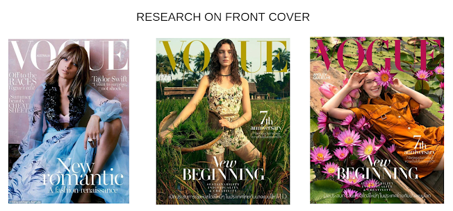
I Think the first content page really shows the minimalistic and classy sides of fashion with not so much colors going on and it looks very structured and neat. I would use this style but I target my magazine mainly towards teenage girls so I think I might need to have a more catchy style to suits teenage magazine conventions and make the color more pop out. Moreover, the second content page seems to be more vibrant and cheerful which have more images in the magazine, but lacks of sentences. So, I prefer the first one but I might change the layout according to my research. Lastly, the last magazine content is a double page spread, so I think it is a more work to do and required extra time to make so I'll probably go with the first design. After I've done some research I have decided to use the minimalistic and neat style.
My sketches:
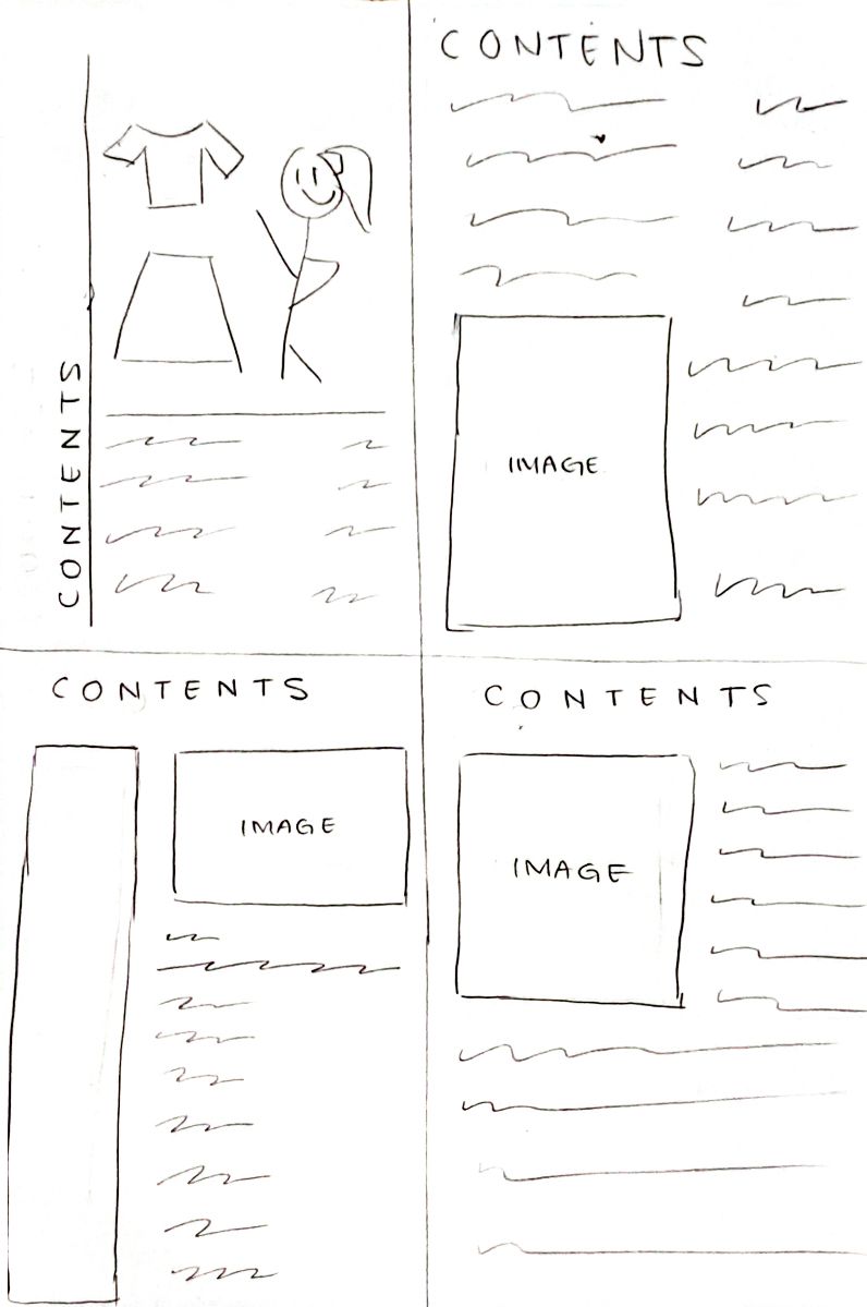
I draw 4 different layout for my contents page and I think since my magazine mostly will be talking about tips and tricks, how to dress up well, confident, and stylish I will need more space for the text and also the same amount of space for the pictures therefore the layout that will suit my magazine the most will be either the top or bottom right. Additionally, I have research more on contents page and have found several interesting and unique ones that I'm considering to try and experiment with.
Things that I have changed/development:
Firstly, this is my first idea of a contents page before I did experimentations with other different layouts. I am not really sure and don't think its great as I think it is too crowded and I want to make my contents page more simple and neat. Moreover, this looks messy as text can't be read even though I have adjusted the color to the brightest but since the background is not plain it won't work. Due to that I decided to make the background being plain and added some pictures to create a sense of neatness and organized to make the text also seems to pop out.
Before that, I have tried creating layer between the main image and the text. However, I think this is does not look good and need further improvement. Hence, after a bunch of trial and error I realized that image cuts are better to put in my double page spread as a friend of mine said so. Due to that, I picked another images to put in my contents page.
Here, I totally changed all the layouts and make the contents title like a curve to imply a meaning of "effortless elegance" as my front cover page mentioned and only have 2 pictures to create a minimalistic style for the magazine and for the audiences to also have a balance focus between the text and the image.
However, my teacher gave me feedback of how my contents page does not really look like a real magazine and I also noticed that especially from the placement of the image as I have never seen a magazine who have this kind of structure before. After some research, and looking through Youtube to find some inspirations I finally get some reference of how I want my contents page to look like
.
I have been contemplating on which background color should I use for my background:
For the color of the background itself I make it similar with my double page spread which is a broken white / cream color as my location is more to nature which implies freedom on choosing and experimenting with your style. After some time, I had a change of heart where the cream-ish color looks too dark and I think it could have an affect to how the audiences would perceive it as dull and uninteresting, therefore, I chose a lighter color for my contents page which is leading more to clean white rather than cream. Additionally, I improve my contents page as I feel like the uses of the negative white space is not being used effectively, this is my new contents page:
I would say I am very relieved with how my contents page turned out, from a lot of changes being made with the design and layout but thankfully after my last research I knew that I was going back to my minimalist design. I also believe that while maintaining simplicity, a minimalist design can also convey a sense of youthful sophistication that resonates with teenage girls. This balance of elegance and modernity reflects the magazine's emphasis on effortless style and appeals to the tastes and sensibilities of its target demographic. On top of that, the color scheme I make it similar with my front cover page as my magazine is very nature and green vibes which would make the audiences feel safe and also connected as that is what the color green symbolizes.
Furthermore, I also included my website at the bottom right corner of the contents page. 'www.seraphicmagazine.id' this website include my full magazine and also additional information about Seraphic Magazine. Due to my target audiences being mainly teenagers, most of the time they will spent their time in the digital media and therefore I think adding website in the contents page would really benefit me as I could reach wider target audiences compared to just printing the magazine.
.png)
.png)
.png)


%20(4).png)
%20(5).png)
%20(6).png)

%20(7).png)
%20(3).png)
%20(6).png)
%20(4).png)
%20(5).png)
%20(1).png)


.png)
.png)