Thursday, 9 November 2023

Magazine article 1st draft


Here is my first draft for my first magazine article

Reflection: Looking back at putting together this magazine article, I have to admit, it was tough going. Trying to juggle a bunch of assignments from different classes while tackling this It was pretty exhausting. I'll be honest, I ended up leaving it until the very last minutes, but luckily, somehow, I managed to get it done. Amidst all the chaos and exhaustion, there was a spark of joy that kept me going as I've always had a keen interest in fashion, so diving into this topic was like diving into my own world of creativity and self-expression. Sure, there were times when I felt overwhelmed, but there was also a sense of fulfillment that I get after finishing this more than 700 words article.

Unveiling the artistry of teenage fashion


Interviewing: teenage fashionista  (Avery)

Tone: Friendly but fashionable

Author: Fashion designer

Front cover: Direct mode of address, directly talking to the audience.

Topic:  the latest trends, offer style tips, introduce you to young fashion influencers, and provide insights into the ever-evolving world of teenage style.


Released: Feb 2023

1st Draft:

The world of fashion has evolved in the modern year. Nowadays, teenagers have a penchant for nostalgia, and this extends to fashion. They love reviving vintage styles from the '80s, '90s, and even the early 2000s. Think oversized denim jackets, scrunchies, platform sneakers, and vintage band tees. It's about blending the best of the past with a contemporary twist.  We'll showcase the latest trends, offer style tips, introduce you to young fashion influencers, and provide insights into the ever-evolving world of teenage style. "Fashion for teenagers is not just about what they wear; it's about the creativity, spirit, and confidence they bring to every outfit."  Says Ava, a sixteen-year-old with a passion for fashion that rivals even the most seasoned of designers. With her keen eye for detail and innate sense of style, Ava has become a trendsetter in her own right, captivating the attention of fashion enthusiasts worldwide.

In her recent interview in Allure TV she share some tips on how to look classy that will turn everyone’s gaze on you with effortless elegance, the key to all time confidence. But what truly sets Ava apart is her fearlessness when it comes to personal style. While some may shy away from bold colors or unconventional silhouettes, Ava embraces them wholeheartedly, using her wardrobe as a canvas for self-expression and creativity. From mixing prints and textures to layering unexpected pieces together, Ava's outfits are a reflection of her fearless spirit and willingness to take risks.

With fashion magazine, First and foremost, confidence is the key to pulling off any outfit. Whether you're rocking the latest streetwear or embracing a classic look, wear it with confidence. Your self-assured attitude will make any ensemble shine, elevating your entire look to a whole new level. Ava also mentioned that experimentation is another crucial aspect of staying on point. Don't be afraid to mix and match different styles, textures, and colors. Play around with layering, try unexpected combinations, and let your creativity flow. Fashion is an art, and your wardrobe is your canvas – so paint it with your unique flair.

When it comes to essentials, invest in timeless pieces that can be versatile in various outfits. A well-fitted pair of jeans, a classic white tee, and a stylish jacket can form the foundation of countless trendy looks. Build your wardrobe around these staples, and you'll always have a solid base to create on-point outfits effortlessly.

Last but not least, accessories can make or break an outfit, so choose wisely. Statement earrings, bold necklaces, and trendy bags can add that extra flair to even the simplest of outfits. Don't shy away from experimenting with accessories – they're an excellent way to express your personality and take your look to the next level.

Paris Fashion Week. Among the sea of designers, celebrities, and industry insiders, one name is on everyone's lips – Ava, the teenage trendsetter whose unique sense of style and infectious enthusiasm have captivated fashion enthusiasts worldwide. Ava responds to the Paris Fashion Week Interviews:

1. What are the key to elegance and finding our own styles?

  1. Statement Accessories: Elevate your casual ensemble with carefully chosen accessories. A statement watch, a stylish handbag, or a pair of chic sunglasses can instantly upgrade your look, making it more polished and put-together.

  2. Footwear Matters: Pay attention to your choice of footwear. Opt for stylish yet comfortable shoes, such as classic sneakers, ankle boots, or loafers. Quality footwear can tie your entire outfit together and contribute to an overall polished appearance.

  3. Play with Textures: Incorporate different textures into your outfit for added depth and visual interest. Mixing textures, like pairing denim with silk or cotton with leather, adds a touch of sophistication to an otherwise casual look.

  4. Effortless Hair and Makeup: Keep your hair and makeup simple and natural. An easy, undone hairstyle and a light touch of makeup enhance your features without overpowering your overall appearance, maintaining the casual yet elegant aesthetic.

2. Can you tell us about your journey into the world of fashion? What initially sparked your interest?

As a child, I would spend hours playing dress-up, experimenting with different outfits and accessories to create unique looks. I think fashion is meant to be enjoyable, so don't take it too seriously. Experiment, make mistakes, and most importantly, have fun expressing yourself through your clothing.

3. In an industry that can sometimes feel exclusive and intimidating, how do you stay true to yourself and maintain your authenticity?

A very good question! I focus on embracing my individuality, cultivating self-confidence, and surrounding myself with a supportive community. By aligning my fashion choices with my values and beliefs, I'm able to maintain authenticity and make a meaningful impact.

In the exciting world of teenage fashion, the key is to be true to yourself and enjoy the process of self-expression. With these tips, you'll be well on your way to mastering the art of dressing with style and confidence. So, go ahead, fashionista, and let your wardrobe tell the world your incredible style story!


Wednesday, 8 November 2023

Terminology


Here is all of the magazines terminologies that I learn in my media class.

Reflection: I think all of the terminologies are really interesting. However, I am having a hard time on remembering every single one of them and sometimes got it switched. I am going to practice more of the terminologies when analyzing the magazines because I also believes that recognizing and using magazine terminologies encourages analytical thinking so it is easier to identify the components of a magazine, such as headlines, bylines, pull quotes, and mastheads, fostering a more critical and insightful approach to media analysis.


Tuesday, 7 November 2023

Technical Skill (online)


This is my technical skill, here I will include online technical skills that I received.

Reflection: 

By embedding the file I think it is actually much easier and effective rather than screenshotting or uploading the file, I could do this in my other subject as well.  

Embedding PDF into Blogger

Since the statement of intent is given in the form of google docs, I have tried screenshotting and put it in my blog but it just turned out to be a mess and not pleasing to look at. Therefore, I learned on how to embed from google docs to blogger. 

Problem: Unable to embed a google docs file into blog

I searched for internet guides and came across a YouTube video that demonstrated how to adjust the size. The procedure is as follows:

1. Click "Share" > "Publish to web" next copied the embed link 

2. HTML view

3. Paste link

4. After the code "<iframe", add  [ height="y" width="x" ]

5. Publish

I watched video tutorial on Youtube on how to embed from google document into Blogger. 


From watching the tutorial video, I am now able to embed my statement of intent


Monday, 6 November 2023

Double page spread: Research + Development


This is my research for my double page spread. Here, I will analyze double page spread on 2 different magazines.


Reflection: 

I believe engaging in research and development (R&D) for my magazine project has proven to be an incredibly enriching experience, firstly, it has provided valuable insights into understanding the target audience. It has also improves my critical thinking about magazine elements and how it creates an impact to the audiences moreover from researching about double page spread I also get some ideas and pictures of how I am going to make my double page spread magazine.


Before Reading

Magazine:

Vogue magazine

Issue:

Date of Issue/ Issue No.: May 2018

Publisher:

 -

Genre:

Fashion

Images:

The double page spread consist of 4 images, with one main image fills the left side and 3 small images on the right side.

Layout


The layout is engaging as it really focuses on the actress, the double page spread is also not really heavy on text as it is really being balanced by the picture. Moreover, drop cap can be clearly seen as the author put it in different color that really catches the attention. The page number can also be found at the bottom of the page

First impressions:

 Interesting and minimalist, there is not much going on in this double page spread.

After Reading

Heading:

 Focuses on the name of the actress

Subheading:

 -

Author:

Photographer is not being mentioned

Article:

This article talks about the changes in Emma Watson's life starting when she is staring as Hermione Granger in Harry Potter and how it is so different from before. Moreover, it also talks about Emma Watson's preferences in clothes and fashion.

Mode of address:


It does not addresses the audience directly. This magazine have a formal writing and it it written in a third person point of view.

Pull Quote:


Yes, this magazine include a pull quote that says "I don't really buy designer stuff. I have a few nice things, but I don't really have the occasion to wear couture too often. This quote has been used to imply that the actress it self doesn't really like to shop often and doesn't really care as much about the latest fashion trend or doesn't keep up as much with it.

Audience:

The audience for this magazine could be the people who loves Harry Potter and a big fan of Emma Watson

Impression:

I think the article is quite boring as it doesn't really engage with the audiences and leading to a more formal style when it can actually created to be more laid back and fun to the audiences.

Inspiration:

What I can learn from this magazine is that the uses of a full picture can sometimes be effective if the magazine is really targeted towards specific people. What I would use when i am making my own magazine is probably the uses of the pull quote and also drop cap.


Reading
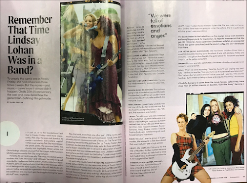
Magazine:Cosmopolitan 
Issue:Date of Issue/ Issue No.: September & October 2023
Publisher:HEARST
Genre:Does it fit into a sub genre? No
Images:3 Images, the images consists of pop girl band.
Layout
The layout is balanced between words and the images, it has a unique way of presenting it is not heavy on the text and images, it contains one drop cap, has page number bellow the page. 
First impressions:It is very catchy and visually attractive with vibrant color of the background 
After Reading
Heading:
Talking about Lindsay Lohan an actress and pop singer who starred in the film 'Mean Girls'

Subheading:Mentioning the iconic one in Freaky Friday 
Author:The author for this double page spread is by Ilana Kaplan
Article:This magazine is about freaky friday fan
Mode of address:
It addresses the audience directly and is a non-formal magazine Is the writing style formal/informal, friendly/s
\serious. Which can be seen through the choices of words which directly talks to the audiences in a casual manner.
Pull Quote:There is a pull quote in this double page spread which says "We were full of emotions and anger"
Audience:This magazine is targeted towards a pop girl fan or the people that looked after Lindsay Lohan.
Impression:I think the layout is pretty engaging as the page is not only filled with text and includes pictures. Moreover, the text is also designed very well which doesn't consumes the whole page and keeping the audiences interested. However, I think they can improve the uses of the drop cap because I think the placement is kind of off and doesn't really matches. 
Inspiration:
I learned that by having negative space in magazine could also be a good thing as it 
creates a pause when the audiences is reading and could create a better 
understanding of the magazine. What I would do the same when i'm making 
my own magazine is that the uses of the picture here is very unique and interesting.

Sunday, 5 November 2023

Targeting Audiences (Genre theory, Demo + Psycho)


Here is my targeting audience research I did with my team mates. 

Reflection: I compared 2 magazines with my group in my media studies class, I learned about how psychographic and demographic really have such a big impact when targeting the audience and really enjoyed identifying them. I think the most important part is also the coverlines which directly speaks to the audience and the different color scheme being used really represents the stereotypes of audiences that the magazine is trying to targets. Also, I am sorry that the mind map is kind of messy because we were focusing more on the group discussion. Overall, I really enjoyed the discussion of targeting audience with my group as I also get a new insight. 


                                                                                         VS 


Saturday, 4 November 2023

Magazine development


Here is the development process of my magazine, I will put all of my ideas here and reflect on the decisions that I make.

Reflection: 

I really enjoyed making my magazine development because it unlocks my creativity, thoughts, and ideas. In my double page spread I would also love to emphasize on the tips and advice presented should not only focus on external style but also emphasize the empowerment that comes with embracing one's individuality. It's not just about what you wear but how your style reflects your personality and makes you feel confident. When editing my magazine development I learned new some new words that could be used for my potential magazine title and also really had a fun time collecting ideas for my possible cover lines.

Genre: Fashion 
sub genre: Clothes / style 

Name of magazine: 

- Grace and Glamour
- Splendid
- Charm
- Beaut 
- Seraphic
- Elegance Now 
- Glam & Style
- Style Muse
- Exquisite 

Out of these titles, I chose the best 2 which is seraphic which means very beautiful and pure like an angel. I want to make my fashion magazine very soft and attracting teenage girls how to dress or style in different occasion.

Possible Cover lines:

'Wardrobe Wonders: Your Guide to Stylish Outfits'
'Fall into style: The Ultimate Seasonal Trends'
'Dare to be different'
'Effortless Elegance, the key to all time confidence' 
'Ageless beauty'
'Glamour redefined' 
'Fashions Future'
'Luxury unleashed'

I would want to choose 'Wardrobe Wonders: You Guide to Stylish Outfits' as my target audience would be female that wants to enhance their wardrobe and need guidance how to style their day-to-day outfit. 
I think it also creates curiosity of the audience and make them wonders what could be inside the magazine that would be life changing. The second cover line that I think is pretty suitable would be 

Images

- Street style: provide inspiration for everyday fashion
- Clothing close up: detailed shots of clothing, accessories, and fabrics. This can highlight texture, patterns, and design elements of the clothes.
- Celebrity fashion 
- Fashion shows
- Behind - the - scene fashion 
- lifestyle

On my main cover I would want to have street style model posing for candid photos to show their attire or outfit. I would want them to look stylish or chic. Due to this I would need someone to dress up and I might need to research on the perfect location to shoot and find less crowded space but also stylish in Bali. 

Double page:
 
I want to make my double page in a modern style so I will make a college for the images to allure younger audience or teenager. I would also love to include call-to-action and the uses of drop cap to further engages the audience. I want my double-page spread to not only offer valuable advice but also engage and inspire teenage readers to experiment and embrace their unique sense of style.


Friday, 3 November 2023

Statement Of Intent

Here is my statement of intent for my magazine 

Reflection: In my statement of intent, I further break down on my target audience and to be in more detail about the demographic and also psychographic. Moreover, I further identify my content overview which is what I should include in my magazine so that I could fit the stereotypes into my magazine's genre. In the statement of intent, I also find some difficulties on identifying my secondary target audience but at the end I managed to brainstorm and find one.

link- statement of intent


Thursday, 2 November 2023

Magazine research


                                                          Here is my research for my magazine


Reflection: I did my magazine research (2 detailed research on the front cover, and 4 less detailed on the double page spread). This research has helped me to understand and to know magazines terminology better and becoming more familiar with it as well as in analyzing the magazines target audience. Moreover, I become better on examining why different colors or typography is used in certain magazine to target their audience. However, I encountered some personal problems when finishing my work such as my time-management skill in a hectic week I rarely have some free time so I procrastinate my work a lot and leaving it before deadlines. However, thankfully I am able to finish my research. 


Front Cover Magazine 

1) 


This is a magazine called "Asri" magazine which Indonesia's portrayal of traditional identity in its content reflects a complex and multifaceted approach to cultural heritage. Through its editorial choices and visual elements especially from the color, Asri magazine manages to capture the essence of traditional values and practices while presenting them in a way that appeals to a modern audience. This duality is evident in its blend of vibrant and colorful imagery with insightful articles on traditional customs and craftsmanship, creating a visually engaging yet informative narrative. By embracing both the old and the new, Asri magazine Indonesia plays a significant role in shaping and preserving the country's cultural identity in the realm of modern media.

Demographic:

- Age: Middle age 

- Gender: Men and women who is interested or have passion in traditional architecture or furniture.

- Location: Indonesia

- Ethnicity: Balinese

- Income: High incomers

- Star Appeal: - 


Psychographic:

- Hobbies: Model making, sketching, and drawing

- Interests: Looking at furniture design and interior design 

- Lifestyle: Love to decorate, paying attention to details, networking and collaboration

- Spending habits: Spending on quality materials, decor and accessories


Uses & gratification:

- Surveillance: People usually read this magazine to gather some information as the strapline said that this magazine is the source of information and aspiration. I think it is very crucial to create a catchy strapline so that audiences can be engaged and interested with the magazine. Moreover, from only looking at the cover the audience will know that the magazine is about traditional interior design, the target audience for this magazine can be students that are interested in designs and willing to learn about Indonesia's interior design.


Further Analysis:

- Masthead: The masthead 'asri' uses the font italics this is used to create elegance or sophistication as italics can give the masthead a more refined and elegant appearance. Magazines aiming for a high-end or upscale image might use italics to convey a sense of sophistication.

-Typography: 

All of the text in the front cover of the magazine is using caps lock or all capital letter except for the masthead, this is usually used to differentiate the brand of the magazine and other information. The uses of capital letter can also be attention-grabbing as It can make the magazine front cover stand out more, which is particularly important on crowded newsstands.


2)


This is a vogue magazine that covers a British actress named Claire Foy, I really like how the color of the writings and also the color of the dress matches and creating balance. The bottom of cover line also very catchy to attract audiences who has interest in fashion or glamour. Moreover, the uses of italics in some writings represents style and aesthetics and to further differentiates from the main point which is the writings with the caps lock. 

Demographic:

- Age: Middle age 

- Gender: Women 

- Location: America

- Ethnicity: -

- Income: Middle class people 

- Star Appeal: Claire Foy 


Psychographic:

- Hobbies: Fashion and a little bit of politics 

- Interests: Looking at jewelries and clothes

- Lifestyle: People who is not really happy to stay in America and need some changes. One of the coverline mentions that 'Being a woman in Trump's America' in caps lock which shows that the magazine also wants to emphasize that topic. 


Uses & gratification:

- Surveillance: People usually read this magazine to gather some information as one of the coverline said 'Vogue's guide to fabulous' which could really peak the interest of women that wants to enhance their quality of life. Moreover, the cover bottom line also have a good hook as they mentions 'The return of glamour'  This would create curiosity. since it suggests that the magazine contains content related to glamour and perhaps a resurgence or revival of glamour in some way. This can encourage people to pick up the magazine to find out more. To add, readers will also expect that the content inside the magazine will be focused on glamour. They might anticipate articles, stories, or visuals that highlight glamorous people, fashion, lifestyles, or trends. I really like how the magazine uses such a word 'glamour' as it also creates aesthetic appeal. This teaches me to find a perfect hook word when i am dealing with my magazine. 


Further Analysis:

- Masthead: The masthead 'vogue' uses the color pink and this is usually aims towards women. 

-Typography: 

All of the text in the front cover of the magazine is either using capital letter or italics. The uses of capital letter is makes the magazine more effective for ensuring that the magazine's title or other critical information is easily readable and recognizable, even from a newsstand or shelf. Moreover, capital letters can give a modern and bold appearance to the cover, making it appear stylish, dynamic, and attention-grabbing. On the other hand, the uses of italics creates a different effect which sets the mood, since It can convey excitement, mystery, or a sense of exclusivity, depending on the context and content.


3) 


Masthead/Title: A-one, it is the brand of the magazine, the color's tone matches with the background to create a sense of warmth and also it is very catchy with the uses the color of red. 

Genre: Fashion and lifestyle

Demographic 

Age: around 30 - 50ish

Gender: Mostly women

Location: Asia

Ethnicity:

Income: Middle to upper 

Star appeal: Asian fashion model 


A-ONE Magazine Indonesia provides a captivating and insightful perspective on beauty as the main character is a middle aged woman who is very healthy and fit. The magazine includes a varied approach to its coverage of beauty, addressing both traditional and contemporary aspects of the subject. It skillfully balances textual and visual elements, combining articles with high-quality images, which not only make the content engaging but also cater to a wide readership. Furthermore, A-ONE Magazine demonstrates an acute understanding of its target audience, tailoring its content to resonate with Indonesian readers while embracing global beauty trends. The magazine's inclusive approach to beauty is particularly admirable, as it emphasizes diversity in terms of ethnicity, age, and gender.

Double's page: 

The A-ONE magazine double page spread on beauty in Indonesia exemplifies several key principles of media methodology. The layout and composition of the spread effectively employ visual and textual elements to engage the target audience. The use of high-quality, glossy images of Indonesian beauty icons and products conveys an aspirational aesthetic that aligns with the beauty standards of the culture. The choice of typography and color schemes is consistent with the magazine's overall branding, ensuring a cohesive visual identity. Moreover, the spread incorporates persuasive language, such as alluring captions and persuasive headlines, to establish a particular discourse on beauty, subtly guiding readers towards certain products or lifestyles.

Contents page: 

A - one magazine has a content page which is very vibrant and colorful which dominantly the color pink or red these conventions are used to target women. The uses of the images also very engaging with the audience especially people who are very interested in health and fashion. The contents page is also filled with pictures of models which implies that the readers would want to look like them or wanting to have some tips on how to be pretty and fit.
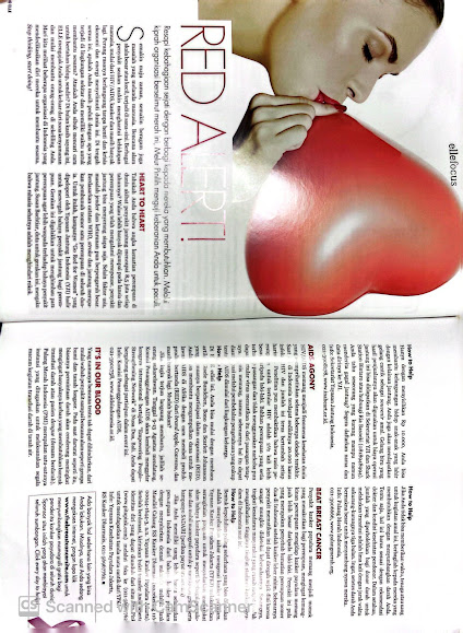
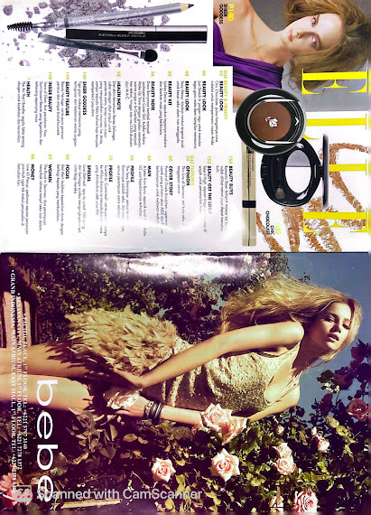
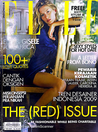
This special edition of the magazine goes beyond the surface of traditional beauty and fashion. By collaborating with the (RED) charity, ELLE underscores the importance of addressing global health crises, particularly the fight against HIV/AIDS. This comparison of high-end fashion and a charitable cause creates a powerful message that engages readers on multiple levels. The choice of Indonesia as the setting for this issue adds a unique cultural context, showcasing both local and international influences on fashion and beauty. Through an analysis of ELLE's (RED) issue, I can explore how media outlets can effectively combine the allure of fashion with a commitment to social change, highlighting the potential of magazines to educate and inspire their readers while making a positive impact on society.

From the cover page of the magazine it is aimed mostly towards middle aged women as from the coverlines the content written there will not engaged younger female audiences, moreover, the picture being represented also looks very simple. In the contents page, make up is being shown but not doesn't stands out since the color is more to calm color and not bright and vibrant color to create a sense of calmness about the topic the magazine is discussing about. Lastly, the double page mostly contains writing and only a big image at the top of the page, this really implies that the aim for this magazine is to provide information and educate the audiences about AIDS/HIV. Moreover, the uses of drop cap is also very simple which connotes the information being provided is a crucial information and is not very playful and fun. 


From the visual elements, the warm colors are often associated with the fall season, creating an immediate visual connection to the theme. These colors include shades of orange, brown, and yellow, which evoke the autumn atmosphere. The font that is similar to sans serif also often chosen for their clean and modern appearance. They lack the decorative strokes (serifs) found in serif fonts, making them more readable and suitable for contemporary design. The color, the choice of white for the font color is a high-contrast option against the warm-colored background, making the text stand out prominently. It ensures legibility and readability. Furthermore, the content page also has a lot of image which will further engages visual audiences with the contents they are providing. Lastly, the double page is talking about the diversity of Asia which is usually aimed to Asian or foreigners that wants to travel to Asia.


From the cover page with the sunset and temple in the background, it features warm, vibrant colors like green, oranges, and yellows, which convey a sense of tranquility and serenity. These colors can evoke feelings of awe and appreciation. In the coverline also mentions Bali's iconic tourist attraction and also Indonesia's exotic beaches which is usually aimed towards visitors that wants to go to Bali or Indonesia. Moreover, the double page includes the temple and also GWK in Bali which implies that this magazine is more towards traditional and culture which will engage audiences that are interested in learning about culture. Lastly, the contents page include the things that the readers could do in Bali and the pictures of nature will be very appealing to adventurous audiences.