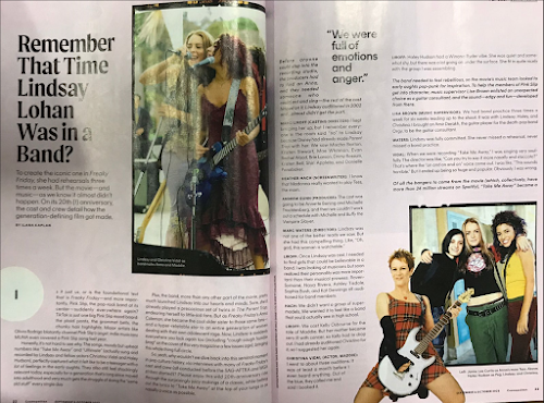
This is my research for my double page spread. Here, I will analyze double page spread on 2 different magazines.
Reflection:
I believe engaging in research and development (R&D) for my magazine project has proven to be an incredibly enriching experience, firstly, it has provided valuable insights into understanding the target audience. It has also improves my critical thinking about magazine elements and how it creates an impact to the audiences moreover from researching about double page spread I also get some ideas and pictures of how I am going to make my double page spread magazine.
Before Reading | |
Magazine: | Vogue magazine |
Issue: | Date of Issue/ Issue No.: May 2018 |
Publisher: | - |
Genre: | Fashion |
Images: | The double page spread consist of 4 images, with one main image fills the left side and 3 small images on the right side. |
Layout | The layout is engaging as it really focuses on the actress, the double page spread is also not really heavy on text as it is really being balanced by the picture. Moreover, drop cap can be clearly seen as the author put it in different color that really catches the attention. The page number can also be found at the bottom of the page |
First impressions: | Interesting and minimalist, there is not much going on in this double page spread. |
After Reading | |
Heading: | Focuses on the name of the actress |
Subheading: | - |
Author: | Photographer is not being mentioned |
Article: | This article talks about the changes in Emma Watson's life starting when she is staring as Hermione Granger in Harry Potter and how it is so different from before. Moreover, it also talks about Emma Watson's preferences in clothes and fashion. |
Mode of address: | It does not addresses the audience directly. This magazine have a formal writing and it it written in a third person point of view. |
Pull Quote: | Yes, this magazine include a pull quote that says "I don't really buy designer stuff. I have a few nice things, but I don't really have the occasion to wear couture too often. This quote has been used to imply that the actress it self doesn't really like to shop often and doesn't really care as much about the latest fashion trend or doesn't keep up as much with it. |
Audience: | The audience for this magazine could be the people who loves Harry Potter and a big fan of Emma Watson |
Impression: | I think the article is quite boring as it doesn't really engage with the audiences and leading to a more formal style when it can actually created to be more laid back and fun to the audiences. |
Inspiration: | What I can learn from this magazine is that the uses of a full picture can sometimes be effective if the magazine is really targeted towards specific people. What I would use when i am making my own magazine is probably the uses of the pull quote and also drop cap. |


No comments:
Post a Comment