This is my thumbnail research and development for my crime documentary project
Research
Firstly, I look for thumbnail inspiration in Netflix and noticed some conventions that film maker used when creating the thumbnail. One of them that stood out the most is the mise-en-scene, the uses of dim or using dark lighting. I believe, this is an effective way for drawing attention to serious subject matter and to imply danger, terror, and mystery.
The text being used is also mostly in bold and capital letters to ensure that it catches the viewers eyes even amidst another content. It also creates a sense of branding which ensures that audiences are aware of the crime documentary and both the thumbnail and the documentary use visual similarities to reinforce the crime theme. It can also emphasize a sense of urgency and importance where it is visually commanding thus compelling the audiences to pay attention to the information. Moreover, crime documentary also often uses desaturated dark colors or monochrome images to create a sense of ambiguity, where details are present but not fully revealed. This can heighten the sense of mystery or suspense, encouraging viewers to watch the documentary to uncover the truth behind the blurred or obscured details.
Moreover, the crime documentary thumbnail also usually covers or blurred the image of the main character in the to imply mystery and creates hermeneutic codes for the audiences. Additionally, crime documentary opening also mostly features lots red color which symbolizes danger, courage, and anger. The camera shots and angles also they all uses direct mode of address which speaks directly to the audiences and it is a technique to construct an emotional bond, and promotes a real relationship between the audiences and the text. It also enhances the interest of the reader as it directly talks with them. The thumbnail covering the eyes also connotes a there is a hidden meaning which the audiences needs to decode from the image.
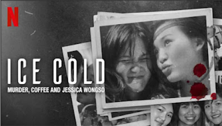
Here are the 2 documentaries that fascinated me and my team mates. First one is What Jennifer Did (2024) it uses split face imagery of the same person but showing two different expressions, this symbolizes the dual personality or character of the person especially from the contrast color, with the right ones being red washed and the left one is more natural colored which conveys happiness and purity. Additionally, the visual textures also resembles a distressed or aged photograph this creates realism contributing to potentially a disturbing or unsettelling narratives. However, me and my team couldn't use this since our crime documentary is about 2 best friends whilst this thumbnail only covered a person. While the Ice Cold documentary has lots of textual elements which is like a news paper clippings and legal document. This visual helps creates a sense of controversy and public scrutiny.
Me and my team mates also agreed that this version of Ice Cold thumbnail is also great and really similar to what we wanted to make as it covered 2 best friends in polaroid frame. The uses of monochrome color also supports our conventions that contrasts to the joyful smiles in the polaroid picture which hints the audiences that there is something underneath the smiles and happiness of both characters. Moreover, again with the uses of capital letters for the title in white color makes it standout against the monochrome background.
Development
This development is made by my team mates (Audrey)
Self Reflection: This reflection is made by Audrey, however, I also contributed by giving feedbacks on how the thumbnail should look like and give ideas on the color grading, typography, and the main image. I think doing the development consumes lots of time as we need to record every single changes that we made and me and my team mates also make several designs for the thumbnail and having a hard time choosing them. Despite that, I learned mostly in the development process on how we can create thumbnail that satisfied our audiences and in line with our target audiences.


No comments:
Post a Comment