Here is my research and development of our artists feedback. This blogpost is written by (Rara and Audrey). However, we all discussed this together as a team to collectively pick which design suits our artist best.
Here is the research for digipaks conducted and reported by (Audrey).
In order to create a digipak, we must understand what a digipak is, including its conventions (especially in the pop-music genre).
Here is our research on
digipaks:What is a digipak?
A digipak is a
style of packaging commonly used for protecting a CD/DVD of an artist’s album.
This packaging is mostly used for CD singles and its limited edition of an
artist’s album. There are two types of digipaks;
regular digipak and a jewel case. Digipaks are commonly high in manufacturing
cost although their resistance is low due to easily disintegrated material
which is cardboard laminated in UV and plastic. Whereas, a jewel case is made
out of injection-moulded polystyrene (transparent plastic) which makes this
packaging more durable. In this case, we were tasked to create a jewel case
version of digipak which includes 4 panels.
Here are the conventions and features of a whole digipak:
Front cover:
- Image of the Main Artist/Band: Pictures (mainly close-ups) of the star to present them directly the audience. This gives the album an identity
- Album title: For audiences to recognize.
- Artist name: Identity of the star.
- Label logo: Identity of record label.
Back cover
- Images of the star: Pictures to present the album in a certain way (according to the intended reading), gives a sense of identity to the album.
- Tracklist: Information for the audience regarding what’s included in the album.
- Special features
- Barcode: Commonly seen in the back when it’s up for sale.
- Institutional information (copyright): Gives audiences information about ownership and restrictions on copywriting.
Spine/Binding
- Artist name
- Album title
- Record label (logo)
- Reference number
These conventions are commonly used to give identity for the audience.
Inside
*All are optional
- Institutional information
- Song lyrics
- Artist/band posters or images
- Postcards
- Promotional information
- Merchandise information
- Website information
Institutional information
These are the copyright notices for the album which includes record label, production company, composer and producer credits, media company, distributors, reference number, year of publishing, and artist informations.
Through these outlines, we have a sense of direction for what to include in our digipak. We understand which conventions to include and which elements to subvert based on our own intentions for the album’s readings.
This is the
resources we used to find the information:
-
https://www.slideshare.net/slideshow/codes-and-conventions-of-a-digipack-52886313/52886313-
https://r.search.yahoo.com/_ylt=Awr92piX4M1n.CUOGitXNyoA;_ylu=Y29sbwNncTEEcG9zAzMEdnRpZAMEc2VjA3Ny/RV=2/RE=1742755224/RO=10/RU=https%3a%2f%2farmchairmaestro.com%2f2022%2f05%2f14%2fpackaging-perspective-jewel-cases-vs-digipaks%2f/RK=2/RS=AEtrfa88SBPbntF5p6NinMC1LTE-Next is the
research on the
dimensions of a digipak so that we are able to create the digipak precisely in sizings. It is important for us to research the dimensions of a digipak in order to create one. Here are images of the sizings that we found on the internet.

For the creation of the digipak, we are gonna utilize a designing app called Canva which includes the sizings of an album cover (1400 x 1400 px). Whereas, according to our research, the front cover (album cover) would be (125 x 125 mm). Tofind the size of bindings we must find the scale and ratio with the actual (in mm) width to be 10mm and the height
would be 125mm.
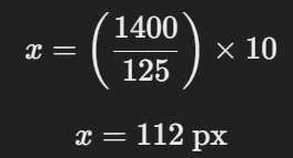
This would result in the sizing of the binding (112 x 1400 px).
-----------------------------------------------------------------------------------------------------------------------------
Here is our research on pop album digipaks conducted by (Rara and Audrey).
Apart from the features and dimensions of a digipak. We must know the conventions of an album cover which would then be used as the front cover of the digipak.
Digipak Cover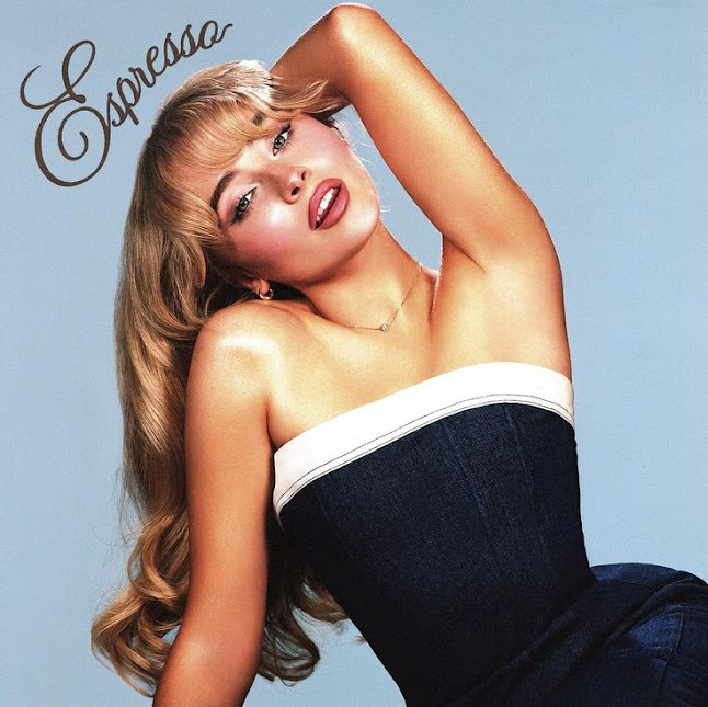
We admire these
portrait shots of the artists that feature a medium close-up shot. The usage of
a medium close-up shot is so that the star/artist can be featured and presented
the most to the audiences. It showcases them and promotes the artist’s image,
these are done to create a sense of identity from the star to the audience so
that they are more recognised. We believe these are what attracts our target
audiences. A generic mise-en-scene would be the usage of vibrant colors in the
pop genre. As those are digipaks from the pop music genre, they must represent
the music and songs in the album through the cover. Since pop music is an
upbeat style, it is most suitable if it gives a depiction for the audience that
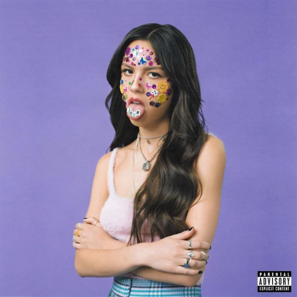
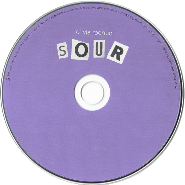
it would be vibrant and colorful. We also liked Sabrinas Carpenter's “espresso”
album (1st on the top row) as the pose gives a flirtatious vibe which we were
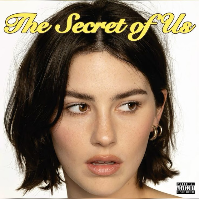
going for. On the other hand we also like Gracie Abrams “The Secret of
Us"album as the text is more readable while still giving the album an
elegant look due to the cursive font used and the colour yellow which connotes
it to being more pure and soft.

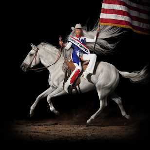


However we did not really like these album covers as it goes against our whole message and theme. As
most uses a middle or long shot and mostly portrays their artist to be more distant. Especially for Beyonce’s album called “cowboy carter” (2nd at the top) it uses excessive amounts of props. The colour
for most of the albums were also quite dull making it seem more sad and melancholy.
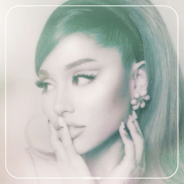
MAIN INSPIRATION:
Ruby - JENNIE
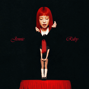
Ruby, JENNIE’s
solo album, was one of our main inspirations for our digipak cover. This
digipak/ album cover properly balances the proportions between colors which
interest us as it highlights the color red as it pops out from the dark, plain backdrop. This will attract the
audiences’ attention to the use of a striking and bold in contrast to the dark and solid backdrop. The
color red was presented nicely in a way that it effectively conveys the color
theme without overflowing the cover. The color red also connotes empowerment
which gives a confident vibe. Commonly, red is associated most with women
specifically meaning that a demographic for this album would be confident
women. This cover, however, subverts the conventions of a pop music album due
to the unconventional usage of both a long shot and a close-up shot. According
to Neale’s Genre Theory, a media text has to be similar enough to be recognised
by audiences by conforming to conventions, while being different to remain
unique and appealing to attract audiences though the subversion of conventions.
Jennie utilised the subversion of generic medium close-up shots of herself as
the star to remain unique for the audience. This reflects the content of the
album itself, which promotes uniqueness and being unapologetically herself, or
self-empowerment. The album title and the artist name is also included and
written in a cursive font, this may connote femininity as women are more likely
to enjoy these. Cursive fonts connotes elegance and class which would be
understandable for why women tend to enjoy cursive. The usage of a cursive font
also reflects the album and the star’s persona as JENNIE is represented as a
classy, elegant, and feminine figure throughout her music career. Moreover, the
shot of the star is taken from a lower angle which makes the star appear more
dominant. This effect creates a confident tone of the star, herself, which would be a consistent delivery of her reel persona as JENNIE in her music
career is always presented as a
global ‘IT girl’ hence a confident woman.
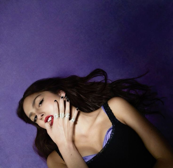
Rosie - ROSE
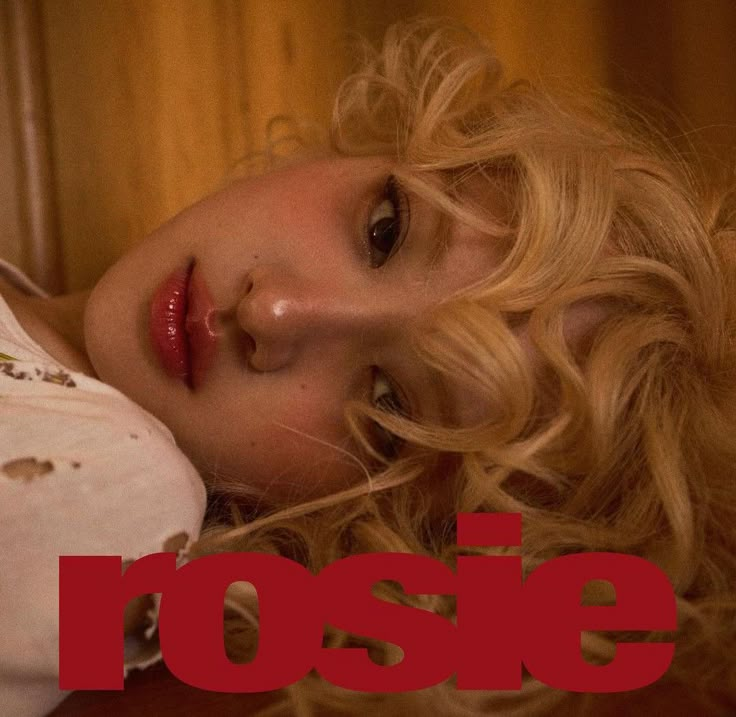
This album cover
piqued our interests from its eye-catching album title. The usage of the color
red represents love which is a common connotation from the media, this is
used to represent the content and themes in the album. This color was used
smartly in contrast to the soft, golden-hued background, this effect made
it pop out to the audiences’ eyes which may capture their
attention easily. The album title, ‘rosie’, is used as it is the artist’s
name/identity, the boldness of the text and how it captures the audiences’
attention creates a bigger focus on the artist’s identity herself.
It labels how the album is called ‘rosie’ and revolves around the star.
Moreover, the usage of the sans-serif font creates a modern aesthetic which may
appeal to a newer generation of adult women. Again, we really liked the
usage of the red color as it creates more focus towards the text and gives
a feminine touch to the album from the connotations given. The artist’s pose is
relaxed and has a direct mode of address due to the dreamy stare and vibes
from the star. This creates a connection between the star and the audience
allowing a deeper connection through the mode of- address and it also
creates more engagement from the audience themselves. The lighting and tone of
the album cover which consists of warm colors and hues evokes a romantic mood
and a hint of melancholy, this may represent the album in general as it
may reflect the emotional tone of the
music.
This album
conformed to the conventions of a pop album from the usage of close-up shots
of the star’s face. This technical element (camera shot) is used to present the
star to the audience
while creating a connection in between. We really liked how the album cover
shows a sense of
vulnerability of the star which may reflect how her persona in the media is
portrayed.
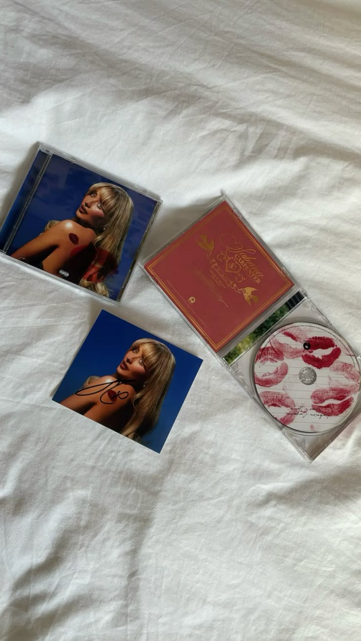
Short n Sweet - Sabrina Carpenter
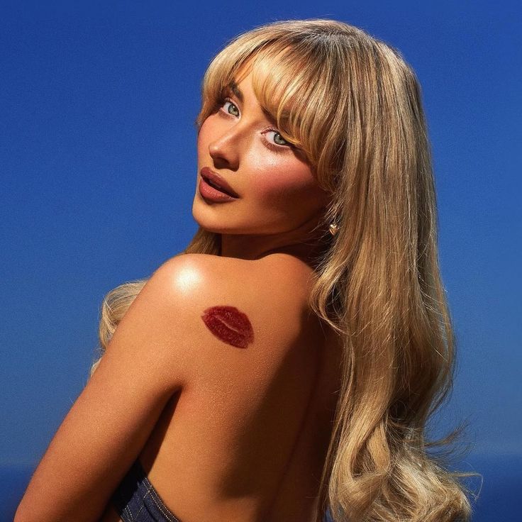
We
really liked the pose from Sabrina Carpenter’s ‘short n’ sweet’ album. The
star, Sabrina Carpenter, posed in a very seductive and elegant way which connotes feminism. A
strong confidence and empowerment is set by the posture and how the star directly
gazes at the camera. This can also be a direct mode of address from the star and audiences to create
a strong emotional bond and deeper connection which allows engagement. The over-the-shoulder gaze
from the Star also highlights how minimal her clothing is in the album cover
which is provocative implying adult contents and mature issues are included in her album. This further means
that the target audience would be an older demographics, preferably young adults to adults of
age 30. Her makeup and style gives a retro vibe which would be a consistent theme of her
brand reputation. Carpenter’s brand/star identity is vintage yet modern, as her music and music
videos are popular for her recurring theme of classic Hollywood or 90s model. Especially, bringing
a very feminine look which is what the star is known for; flirtatious persona. A red lipstick
kiss mark is seen on her shoulder which is a symbol of love and passion which are the themes of her
album, songs. The kiss mark stands out due to the bold color (red) which contrasts the whole
color theme in the album cover which makes it very eye-catching to the audience. The color
blue in the background is very calming which may be the intended reading of the
usage of the color blue. It may connote peace and relaxation which reflects how
the songs in her album are. Regardless of the pop genre, her songs aren’t too
hype or upbeat which is conveyed through the music album cover by the usage of
the color blue. We found that most pop music albums rarely includes any texts (title
of album and artist name) as they tend to focus on their star in the front
cover. This means how they are portrayed in the cover affects how they are
presented in the media along with their reel persona as proven. From knowing
the artist, audiences may recognise the themes and tones of their songs due to
the representation itself. This album cover conforms to that convention so
Sabrina Carpenter fans can recognise her album.
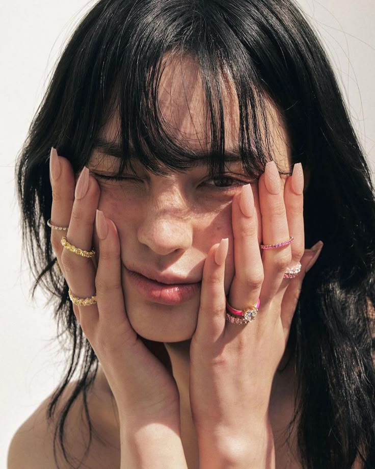
Here are some pictures of pose ideas (Rara) found on Pinterest.
We chose these
pose ideas as we want to convey a direct mode of address from our star by
looking directly at the camera. This allows our artists to have more of a
personal connection with their audience. Moreover, we intend to bring a very
feminine tone to our star as it is her persona, which is why we looked up
elegant and flirtatious poses associated mainly with females. We also want to
create a dominant reading of confidence and self-empowerment from our artist’s
album and persona. We didn’t decide on a single pose as it is better to have a
range and variations of different poses for backup. We want to experiment and
see how it looks as the cover before setting a final choice, hence
trial-and-errors.


 Back Cover
Our research on
the digipak's back cover includes pop female artists. Here we can see that most
albums' back covers have a tracklist with a barcode and production
company/credits. We used these ideas as a rough draft on what theme our
artists' album (Cinta) will be like. Depending on the tracklist and the overall
colour scheme, pose, and design of the back cover, it includes elements that
make people understand the star better, as some have a general overview of what
the album is.
 Binding/Spine
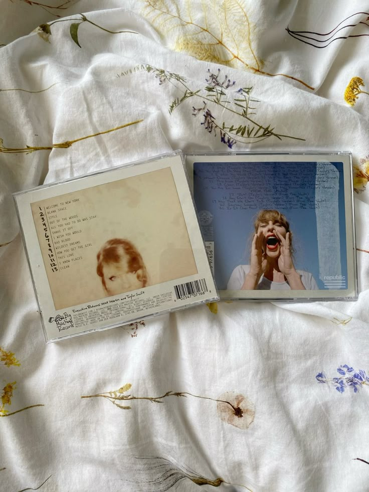
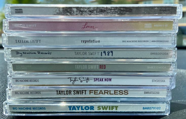
We weren't quite sure on how to develop this part of our digipak. So in order to gain more under standing we found a picture of Taylor Swift's albums spine lined up together, where we found a
digipak binding usually consisting of the stars name, album, production company, and a code
of referral. And it all uses the same theme from the back and front cover meaning a digipak
should have a cohesive theme throughout the outside and inside so audiences can easily know that it's our artist's trademark.
 CD Cover
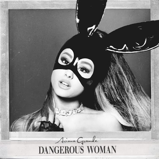
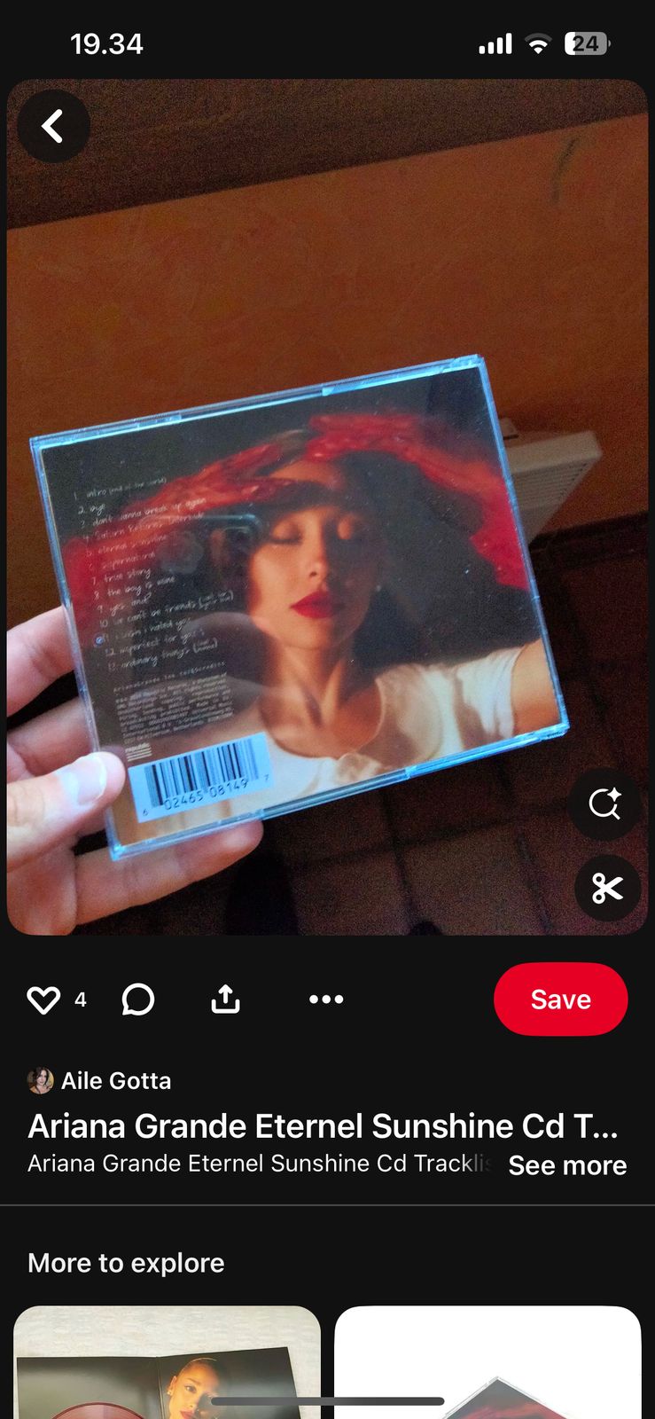
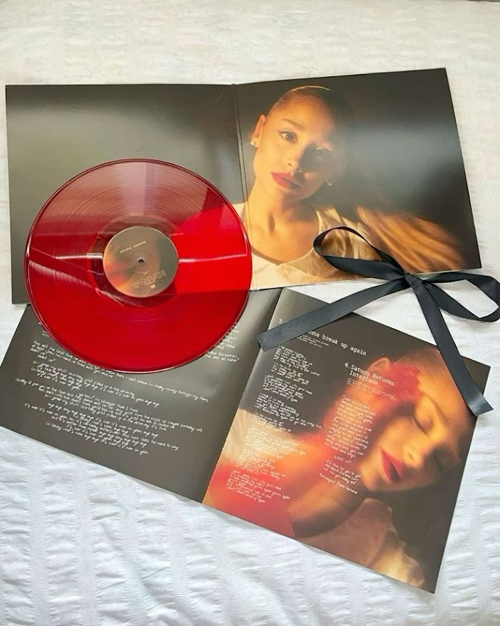
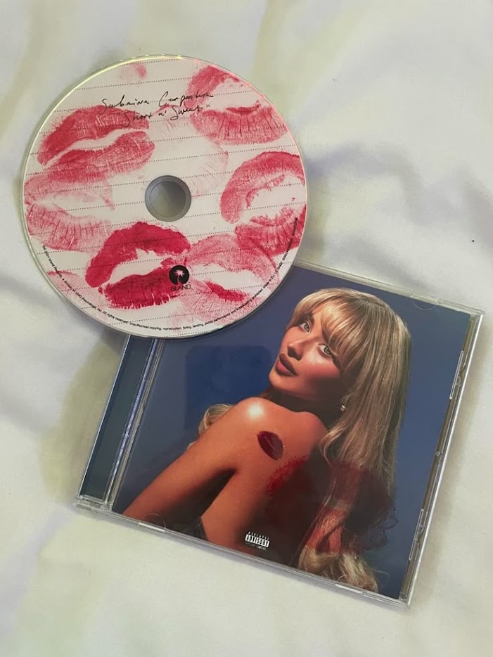
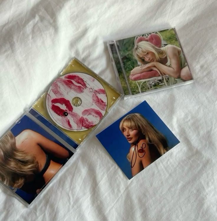
Here my teammate (Rara) compiled different artists' CDs that fit the overall genre of our star (Cinta). As some artists usually use a soft colour we plan on using the inspo from Ariana Grande and Sabrina Carpenters digipak (1st & 2nd at the top) as it shows off more of the artists feminine side and personal touch with Sabrina’s kisses and handwriting while Ariana Grande’s is bold and almost neon red which connotes her confidence.
 Other inspirations
Here we have multiple pictures from Pinterest and google of our 2 artists that inspired our star most which are Sabrina Carpenter and Olivia Rodrigo. As our main theme is for our star (Cinta) to be bold and flirty, we decided to use Sabrina’s iconic kiss mark to become the main trademark of our Star.
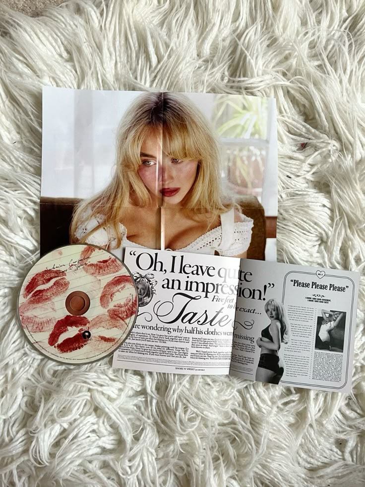
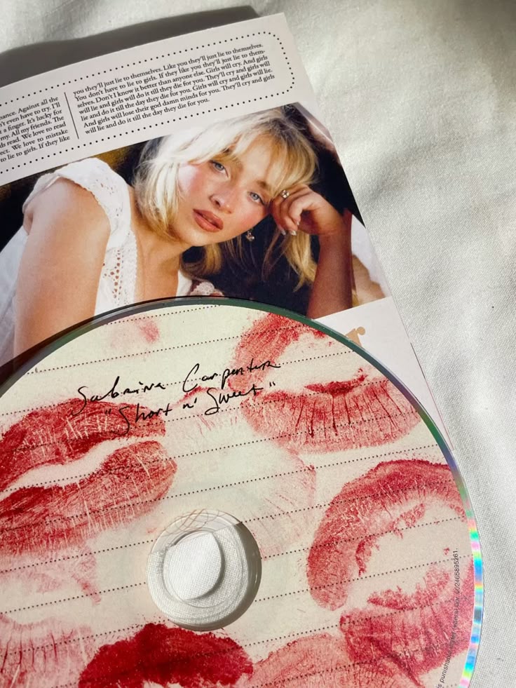
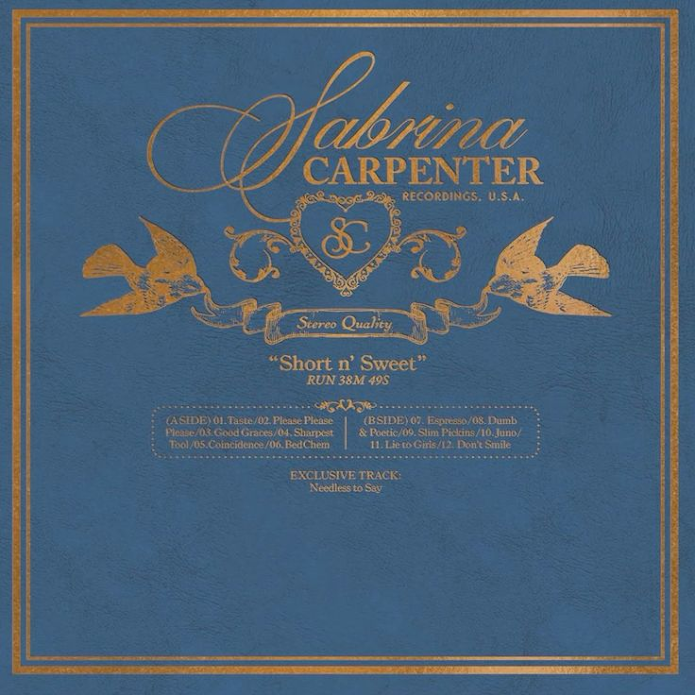
This was our
main inspiration for our tracklist page for the back cover of our digipak that
we took from Sabrina Carpenter’s ‘short n’ sweet’ album. This piqued our
interest due to the simplicity of the design that clearly conveys the message
(contents and tracklist of the album) clearly while keeping a creative form of
display. The usage of cursive and serif fonts were very classy and elegant
which could really attract our target demographics (women). Another feature we
liked would be the usage of texture (leather-like) which really makes the
digipak design more realistic and it was just a fun and creative element that
supports the whole aesthetic of ‘nostalgia’ conveyed in her album.
-----------------------------------------------------------------------------------------------------------------------------
Here is the
Development progress: Digipak cover designs: embed cover:

The
Weekend by Audrey Soedargo
Binding design:
 CD:
CD:
embed cd:
CD - MG25 by Audrey Soedargo
MOCKUPS:
MOCKUP - THE WEEKEND - MG25 by Audrey Soedargo
Here is the
STEP-BY-STEP DEVELOPMENT created by (Audrey and Rara).
Self-reflection: My teammates consists of 4 members and due to that Audrey and Rara are the ones who are in charged of the digipak whilst I (Kalista) and Chelsea are in charge of the social media. However, through out this digipak development they have been active on always seeking for input and asking for our opinions which really involved everyone in the decision making from the process until choosing the final product. This definitely increases my contribution as they are involving me and Chelsea throughout the process which does not leave me behind if there are any major changes along the production of the digipak. I would say having an open discussions especially when we are working on different things are crucial so that everyone are on the same page and could contribute and give suggestions when are needed. I contributed through giving comments, suggestions / feedbacks, and not to forget praises or encouragement to Audrey and Rara. Despite us doing different tasks, the digipak and social media presence needs to have the same vibes and style so that we could be consistent with our brand identity and tailor our target audiences better.


